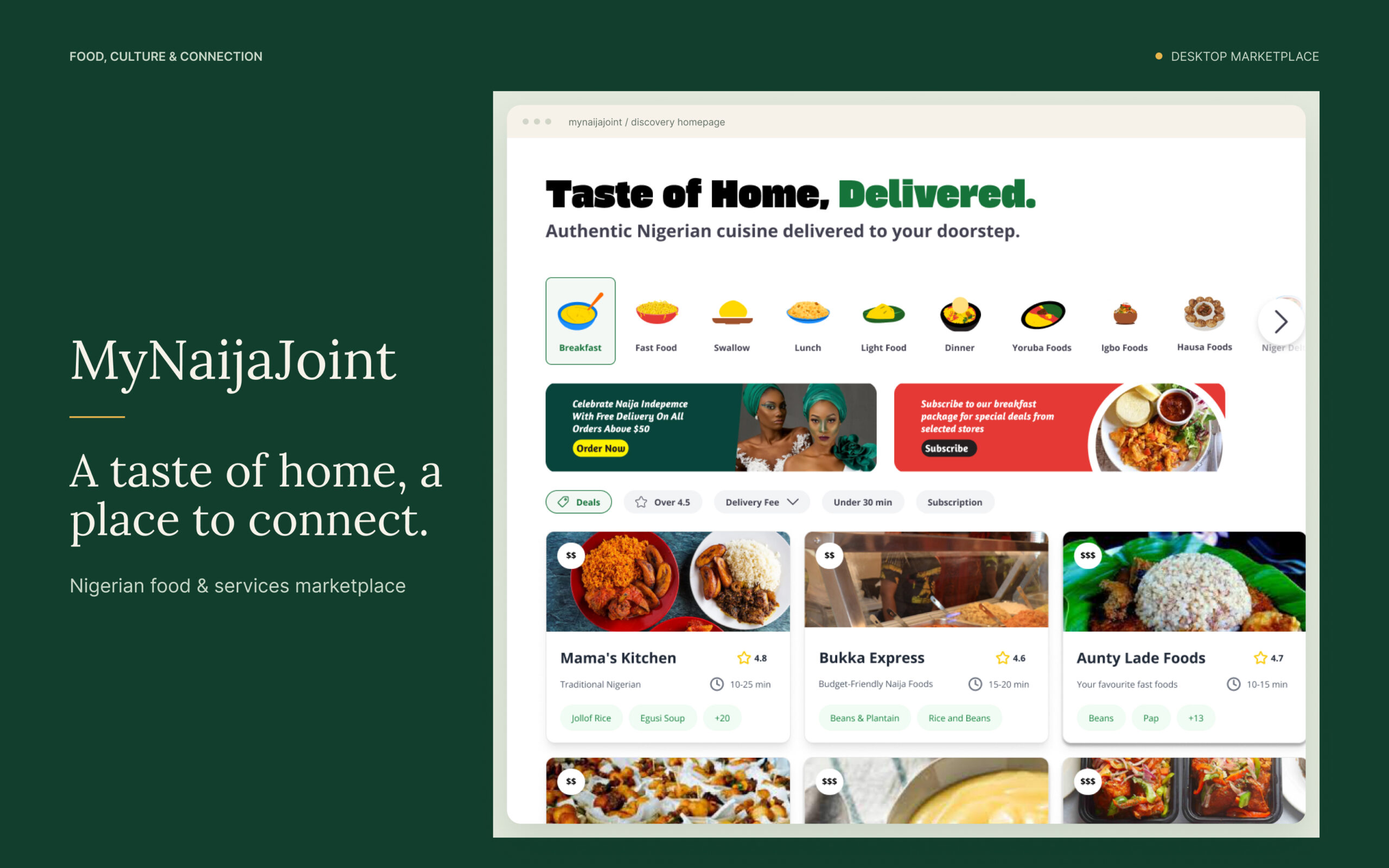
One marketplace. Three perspectives.
MyNaijaJoint brings Nigerian restaurants, local food businesses and event services into one desktop experience. I designed interfaces for three connected perspectives: customers discovering and ordering, vendors joining and managing their businesses, and a platform team overseeing the marketplace. The aim was to give each role a clear place to work while keeping food, culture and community at the centre.
Familiar flavours. A clear place to start.
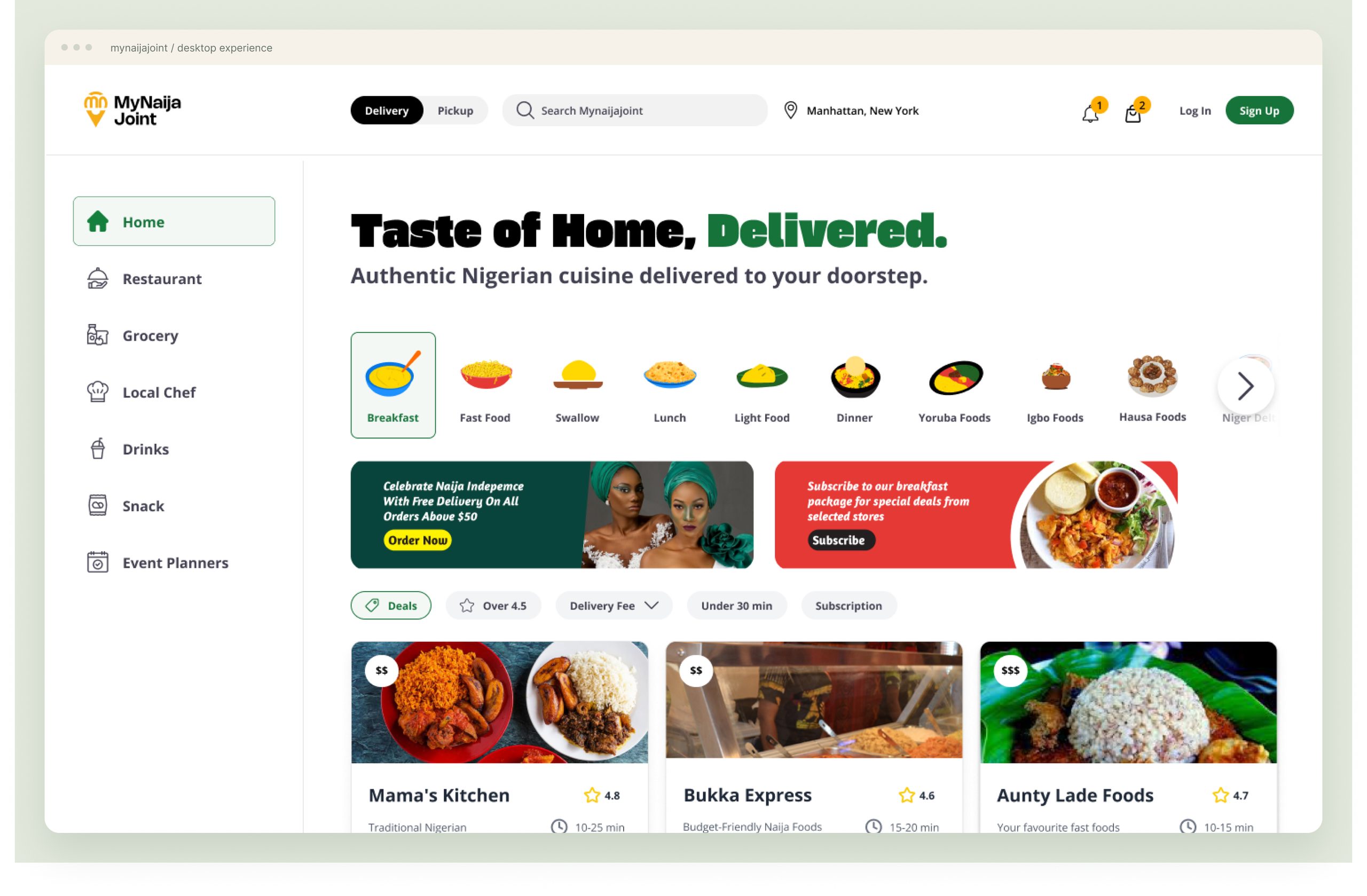
Discovery begins with recognisable dishes and regional cuisine. Yoruba, Igbo, Hausa and Niger Delta categories sit alongside meal occasions, giving the directory a distinctly Nigerian starting point. Delivery or pickup, location and practical filters keep the ordering context close. Restaurant cards bring photography, cuisine tags, ratings and estimated delivery times together so customers can compare options before opening a menu.
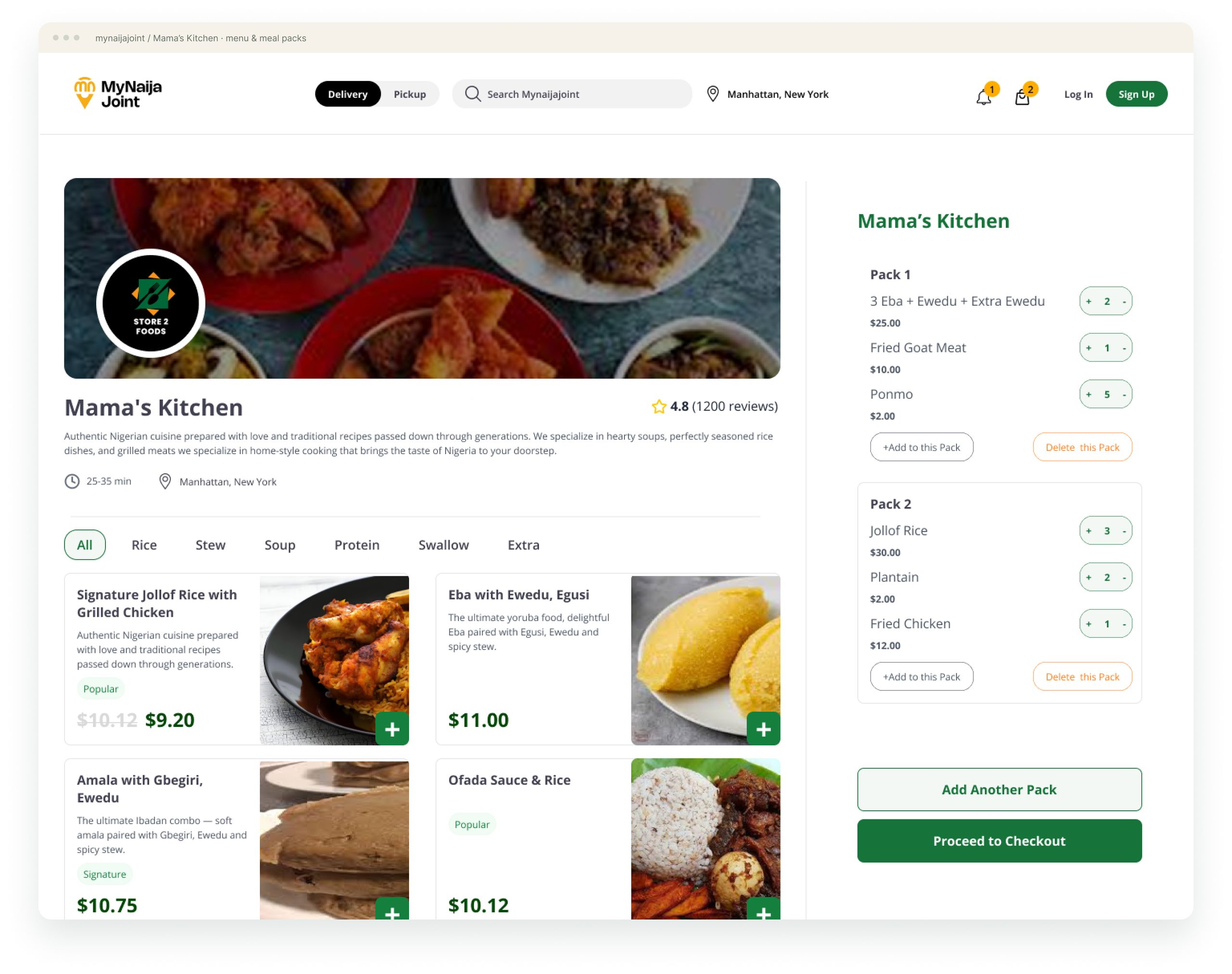
Every pack has its place.
A restaurant menu and a pack-based cart work side by side. Customers can group dishes into separate meals, adjust quantities within each pack and review their choices without losing the menu. Add Another Pack makes the grouping model explicit, while Proceed to Checkout gives the order a clear next step. This showcase covers menu selection and cart organisation; a completed checkout is outside the supplied screens.
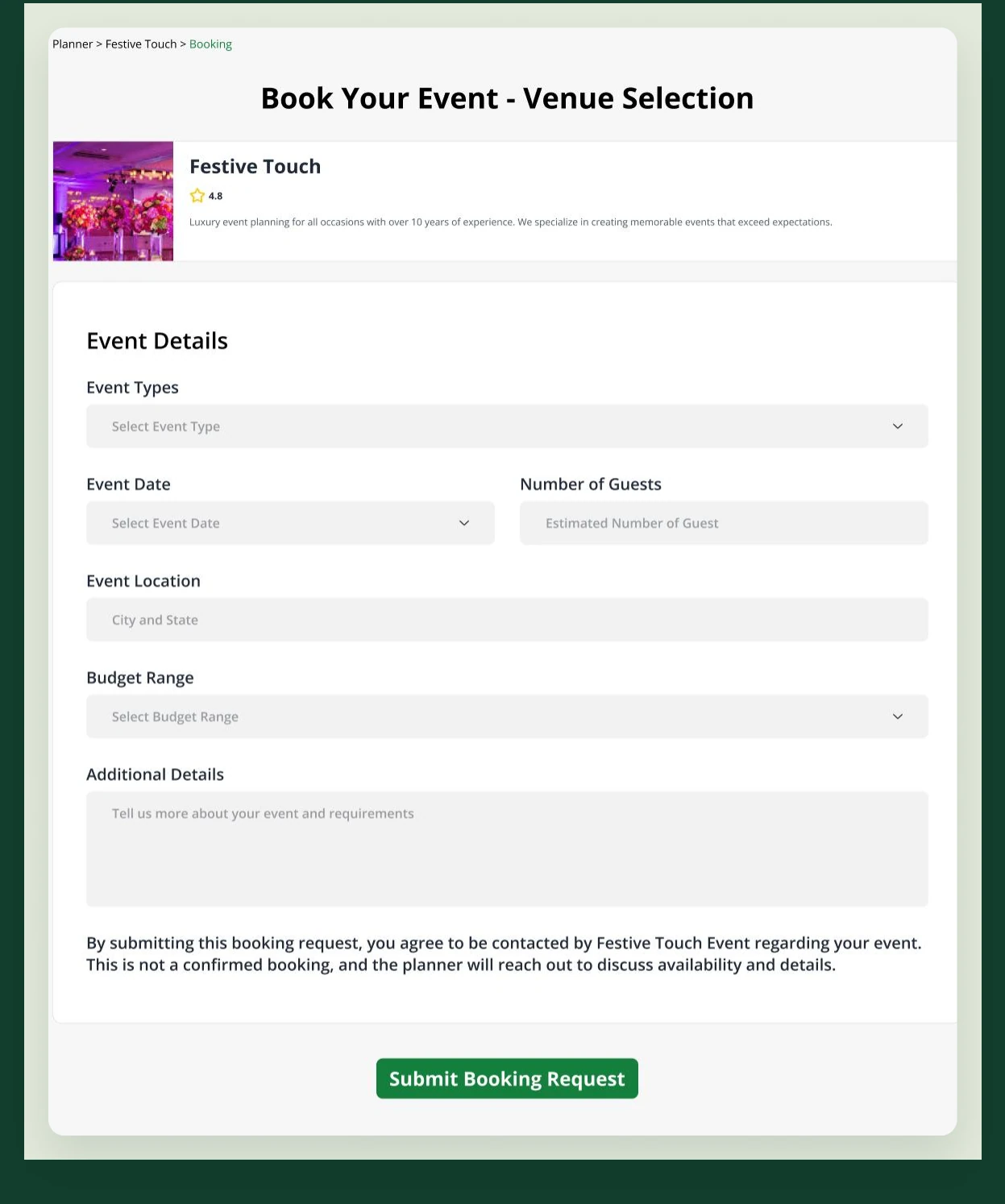
For the moments worth gathering for.
The marketplace also makes room for event services. A structured enquiry collects the occasion, date, guest count, location, budget and additional details, giving the planner enough context to start a useful conversation. The form distinguishes a booking request from a confirmed reservation: the planner follows up to discuss availability and requirements.
A guided way into the marketplace.
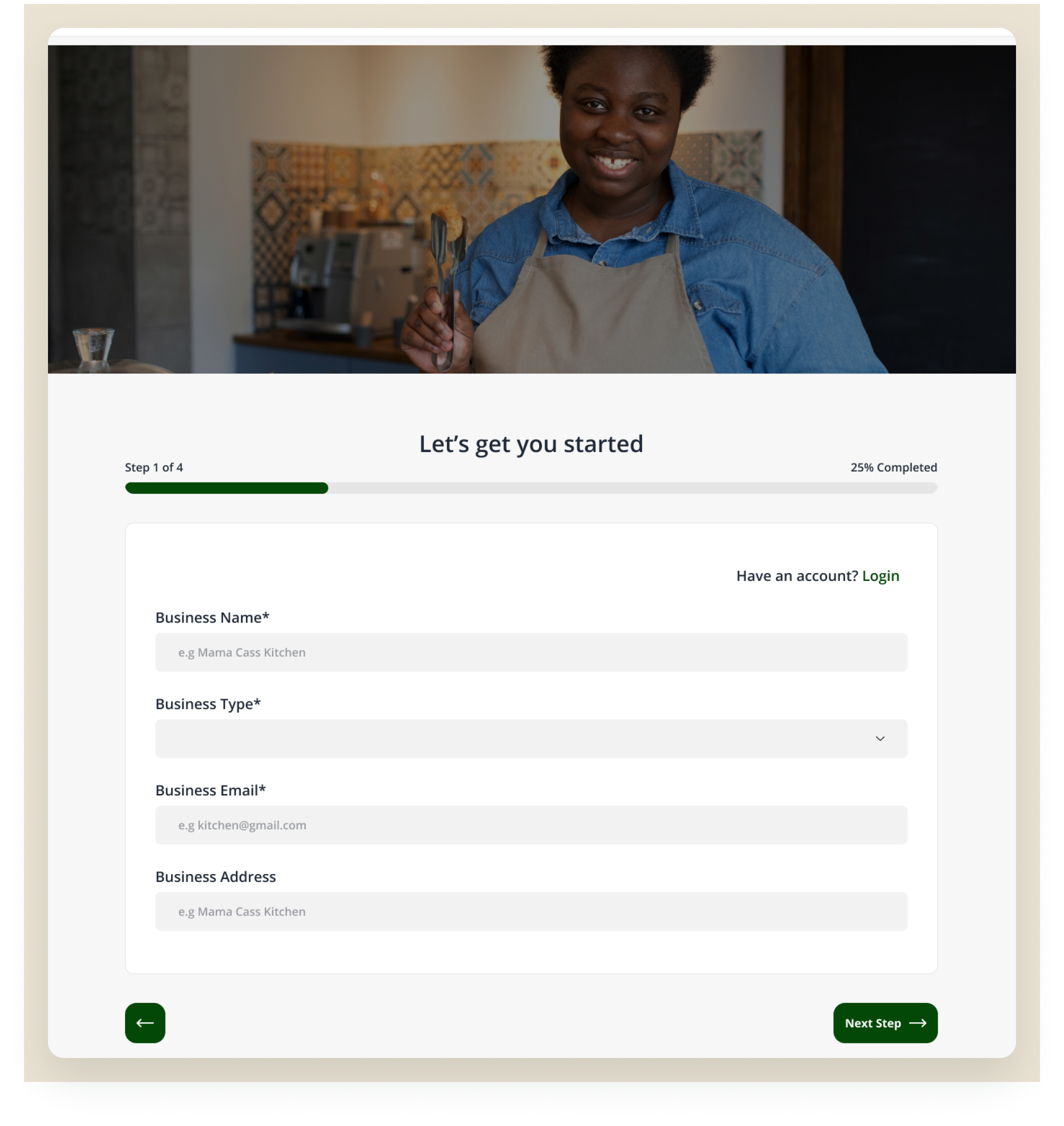
Vendor onboarding organises setup into four stages: business details, contact and compliance, description and operating hours, then documents and submission. The opening screen pairs a visible progress indicator with essential business information. This establishes a clear starting point and keeps later operational requirements within an understandable sequence.
See the business in one place.
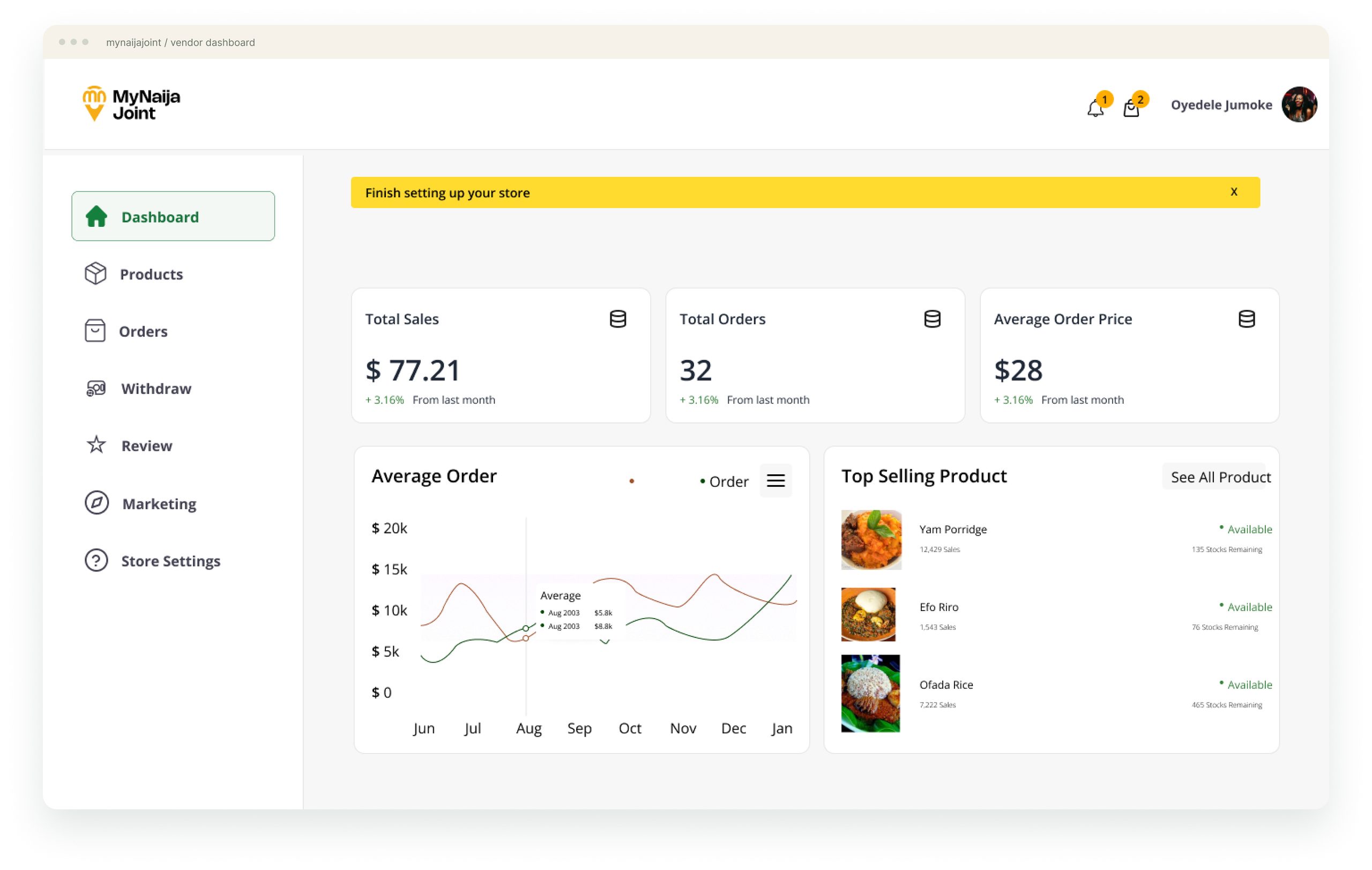
The vendor dashboard brings sales, order totals, average order price and top-selling products into a store-level overview. Navigation connects that summary to products, orders, withdrawals, reviews, marketing and store settings. The hierarchy separates the quick status check from the tools needed to manage the business day to day.
Keep the wider marketplace in view.
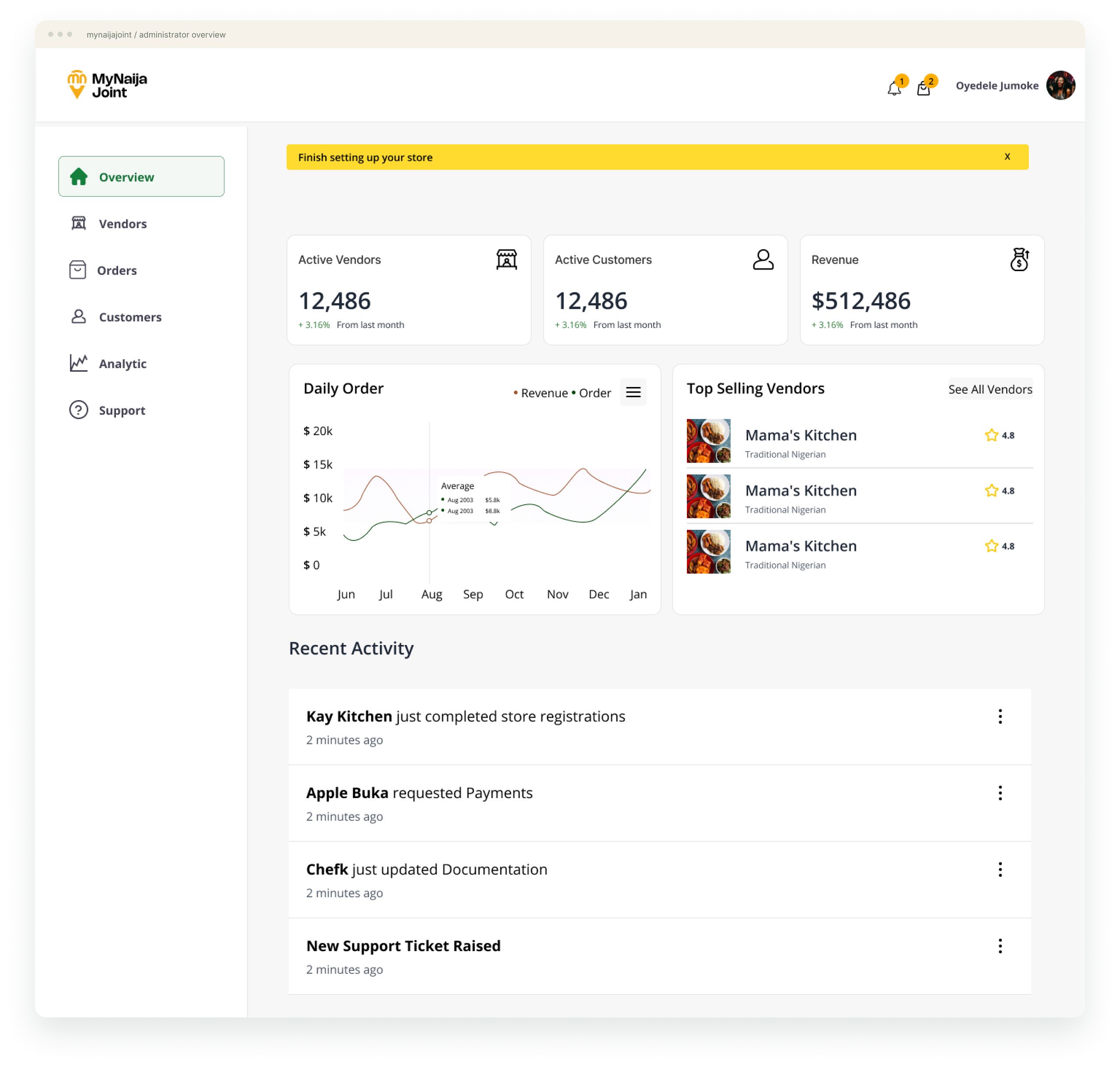
The administrator view shifts from one store to the wider platform. Vendors, customers, revenue and recent activity share an overview, while the navigation groups marketplace management and support tasks. Registration updates, payment requests and documentation sit in the same operational context. All figures shown in these dashboards are sample interface content.
Familiar at the front. Connected behind the scenes.
The design connects culturally specific discovery with practical meal organisation, guided vendor setup and distinct operational views. Green accents, food-led imagery, clear navigation and repeated card patterns hold the experiences together. The result is a coherent desktop interface spanning discovery, ordering and marketplace operations.