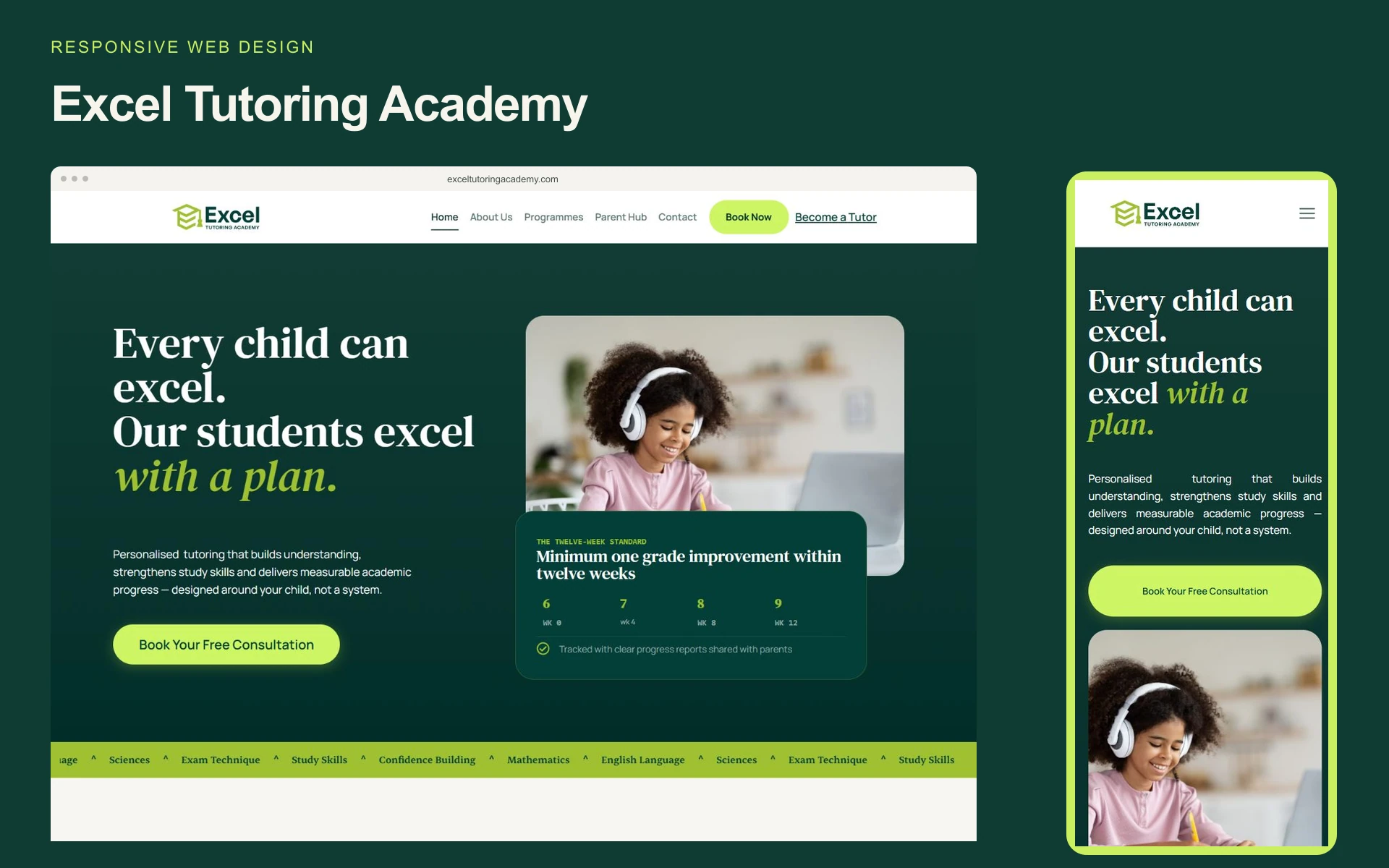
An academic partner, with a clear point of view.
I designed the Excel Tutoring Academy website to make its personalised approach easy to understand. The experience brings the academy's offer, its subject programmes and information for parents into one consistent visual system. The central idea is a learning plan: a simple thread that connects the opening message to the details a family needs before making an enquiry.
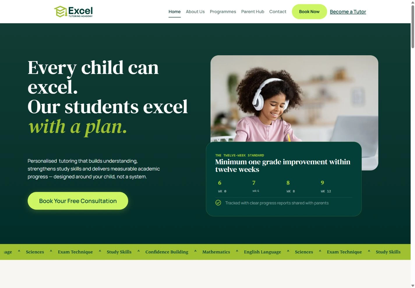
Confidence starts with the first impression.
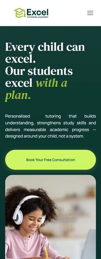
The homepage pairs a deep green foundation with expressive serif headings and bright lime accents. Student photography brings warmth, while a compact progress panel gives the academy's twelve-week message a visible form. The consultation action stays prominent. Together, these elements establish a distinct identity and guide attention from the promise to the next step.
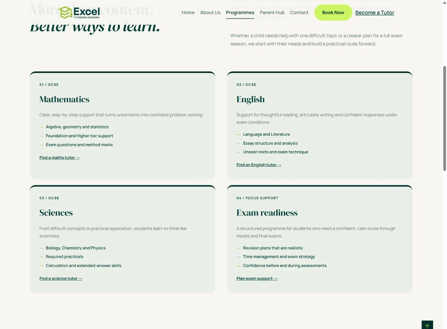
Make the offer easier to compare.
Programme information is organised into repeatable cards for Mathematics, English, Sciences and Exam readiness. Each card separates the programme name, a short explanation, practical topics and an enquiry link. The repeated structure lets families compare support options without having to work through a dense wall of text. Subject detail gives the page substance while the hierarchy keeps it approachable.
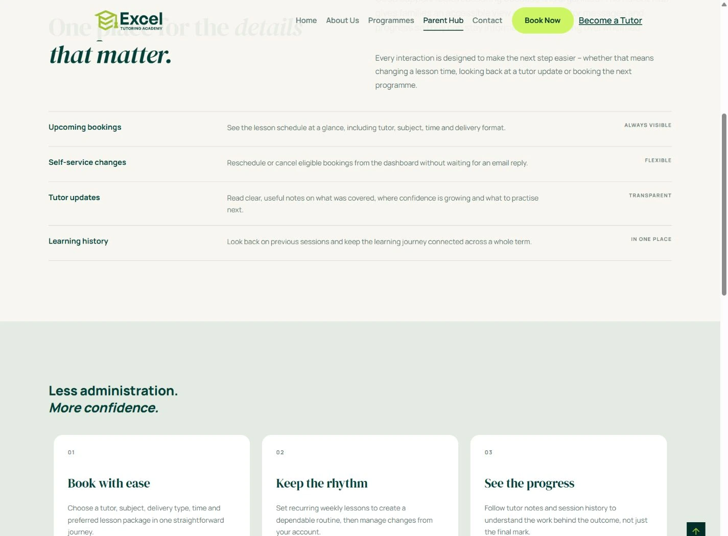
Keep parents close to the learning journey.
The Parent Hub page explains the details families can expect to stay informed about: upcoming lessons, changes to bookings, tutor updates and learning history. I treated this as a reassurance page, using concise feature blocks and an orderly layout to communicate how the relationship continues beyond the first enquiry. The showcased screen is the public information page, rather than an account dashboard.
The same character, on a smaller screen.
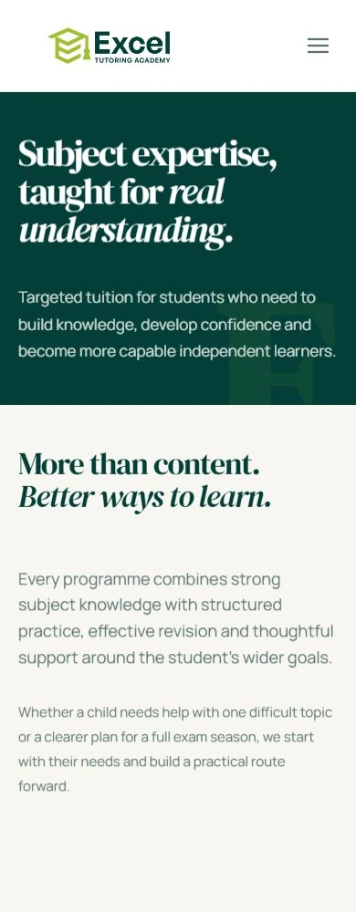
On mobile, the navigation becomes compact and the hero moves into a single column. The opening statement and consultation action appear before the supporting photograph, keeping the main message accessible early. Programme content follows a vertical reading rhythm, with the typography and colour palette preserving the same identity as the desktop site.
A clear route from interest to enquiry.
The design connects an expressive introduction with structured programme information and practical parent guidance. Repeated consultation and WhatsApp routes give interested families a familiar way to continue the conversation. The result is a coherent web presence that makes the academy's offer easier to explore while keeping its personality visible throughout.