A welcoming introduction to care.
I designed the Harbour Wellness Centre website around a calm and reassuring first impression. The site introduces the centre, explains the areas of support and gives visitors a way to stay connected as it prepares to open in Lagos. The aim was to make the information approachable, with people and their experiences taking priority over a clinical or impersonal presentation.
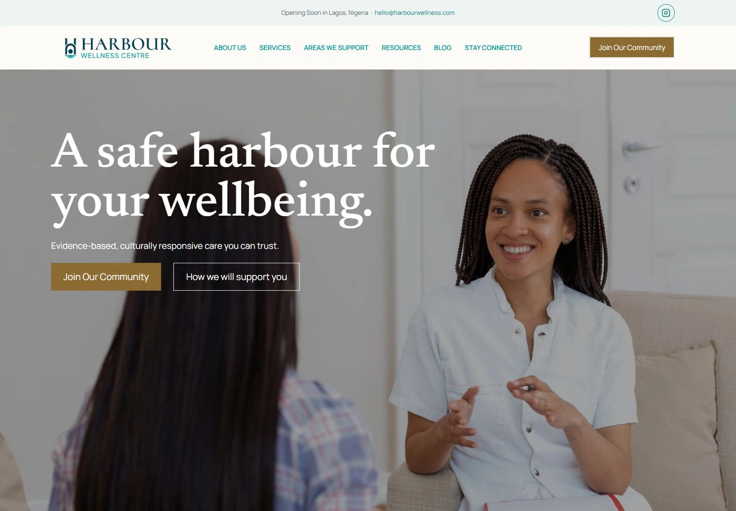
Let the visual language do some of the reassuring.
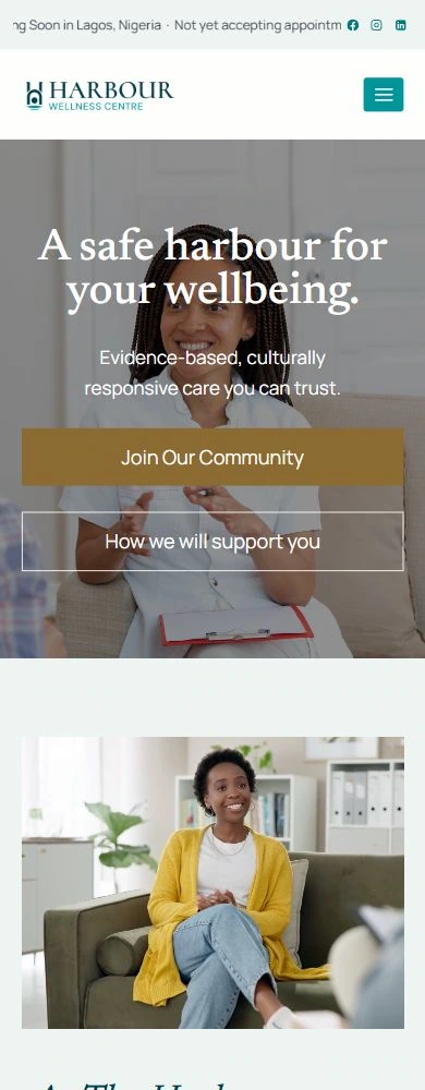
A large photographic hero and an open serif headline set the tone. Teal, warm neutral backgrounds and restrained gold accents give the site a consistent character. The photograph keeps a person at the centre of the composition, while the overlay preserves space for the message and the two opening actions. The design balances an expressive introduction with a clear reading hierarchy.
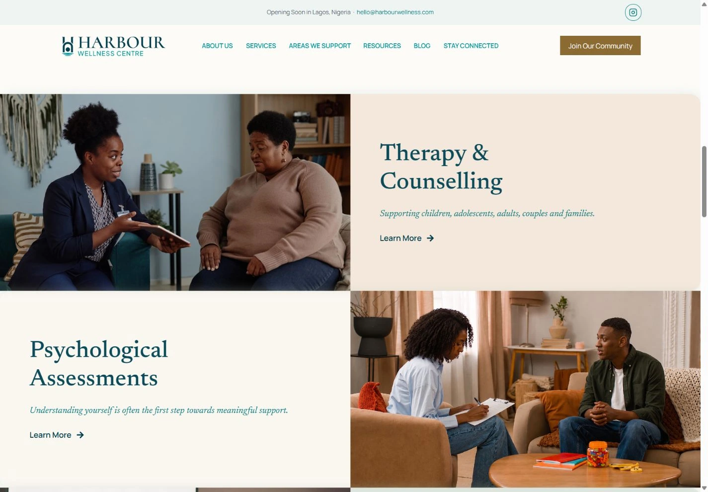
Give each service room to be understood.
Alternating photography and text panels make the service overview easy to scan. Therapy, assessments and other support areas receive their own space, rather than competing inside a dense directory. Short descriptions explain the starting point for each service, and repeated Learn More actions provide a consistent route into further information.
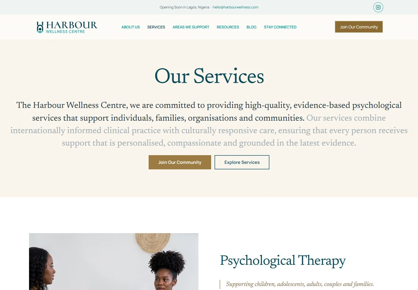
Build trust through clarity.
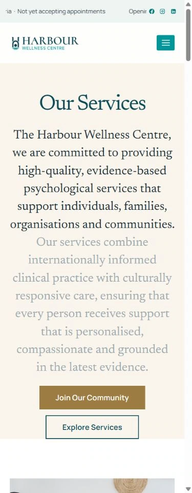
The services page continues the same visual language with a focused introduction and a structured progression into individual areas of support. The content gives visitors context before asking them to take action. Community invitations suit the centre's current stage: the website presents its opening status clearly rather than suggesting that appointment booking is already available.
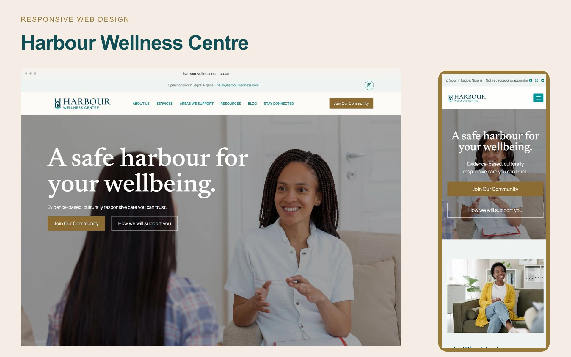
Carry the calm into mobile.
The mobile layout brings navigation into a compact menu and stacks the primary actions beneath the opening message. Typography, photography and spacing carry the same character into a narrower canvas. Service information follows one clear reading column, allowing the visitor to move through the introduction without competing panels or a crowded layout.
An invitation to stay connected.
The website brings the centre's identity, service information and community invitation together in one cohesive experience. Mailing-list and contact routes support an ongoing relationship before the centre opens. The design gives the organisation a recognisable web presence while helping visitors understand who it is for and how to take an appropriate next step.